Appearance
进阶难度
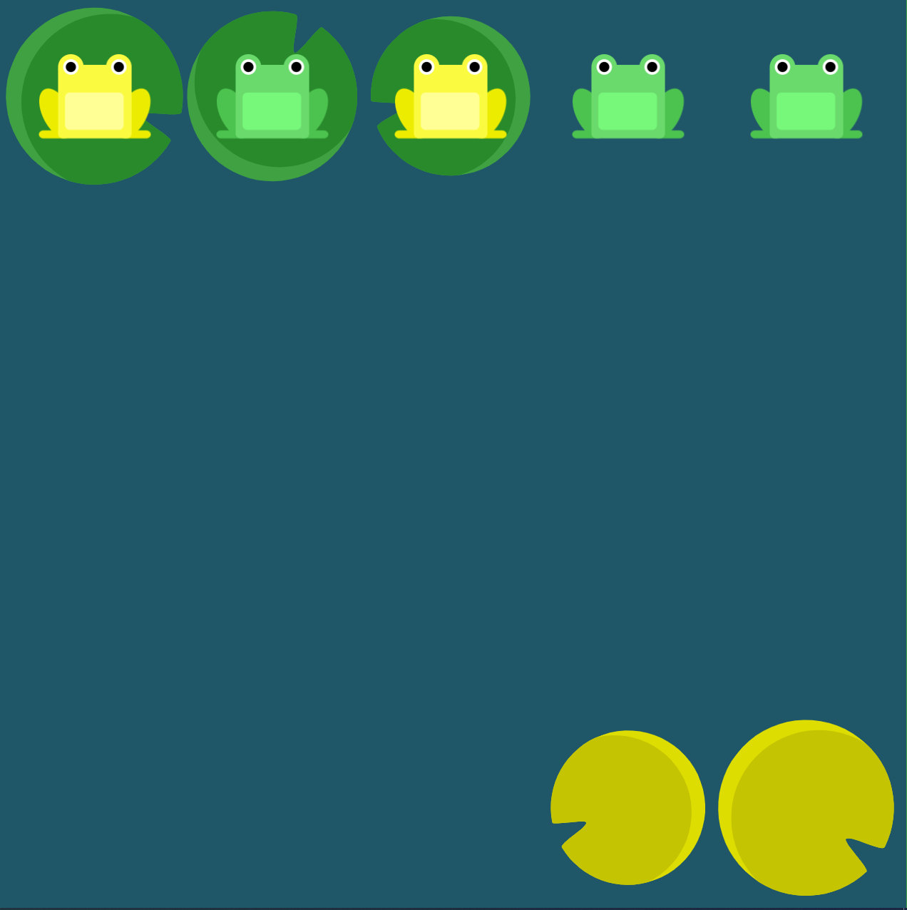
Level 14
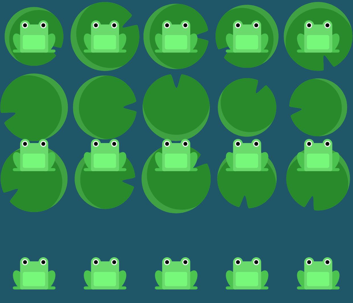
有时候让行或列的顺序倒转不足以实现我们的需求。在这个例子中,我们将在个别元素上使用 order 属性。order 的默认值是 0,同时我们也可以为其设置一个正的或负的整数值。
使用 order 属性,根据睡莲的顺序为青蛙重新排序。

ANSWER
css
#pond {
    display: flex;
}

.yellow {
    order: 1;
}Level 15
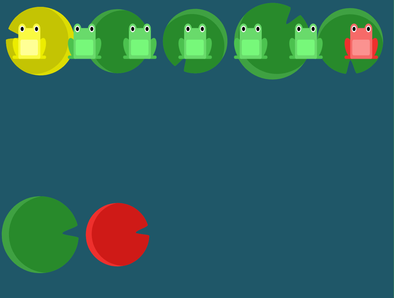
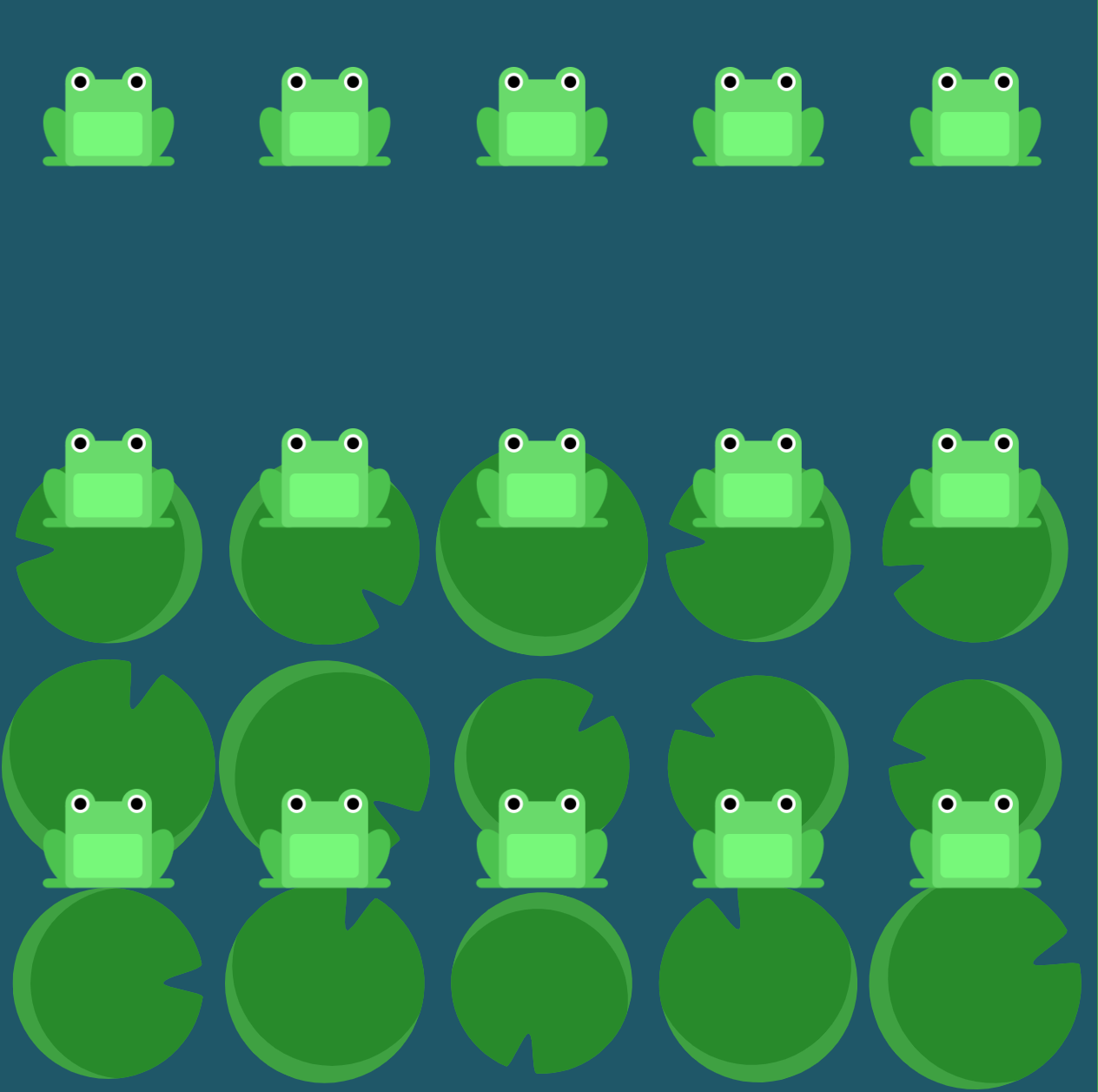
使用 order 属性把红色的青蛙放到红色的睡莲上。

ANSWER
css
#pond {
    display: flex;
}

.red {
    order: -1;
}Level 16
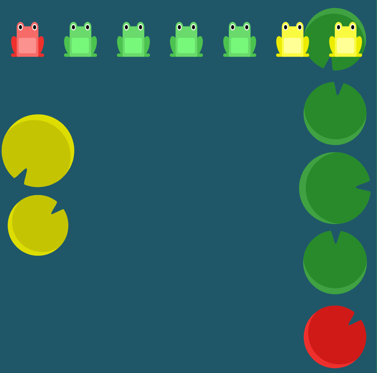
还有一个可以使用在个别元素上的属性,align-self。这个属性具有和 align-items 相同的取值范围,但 align-self 是为个别元素使用的。

ANSWER
css
#pond {
    display: flex;
    align-items: flex-start;
}

.yellow {
    align-self: flex-end;
}Level 17
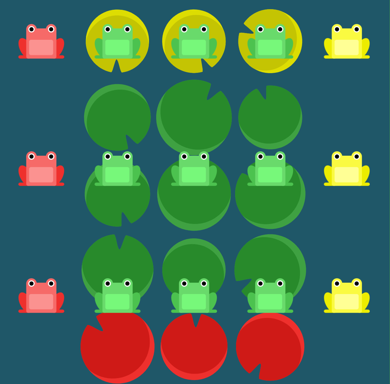
将 order 和 align-self 组合使用,帮助青蛙们到达各自的目的地。
ANSWER
css
#pond {
    display: flex;
    align-items: flex-start;
}

.yellow {
    order: 1;
    align-self: flex-end;
}Level 18
青蛙都挤在了一排的睡莲上!使用 flex-wrap 将它们散开。
flex-wrap 接收的值有:
nowrap: 每个元素都挤在一排中wrap: 元素会换行分布wrap-reverse: 元素换行并反向分布
ANSWER
css
#pond {
    display: flex;
    flex-wrap: wrap;
}Level 19
结合使用 flex-direction 和 flex-wrap, 帮助这支青蛙大军形成三列有序的纵队。
ANSWER
css
#pond {
    display: flex;
    flex-direction: column;
    flex-wrap: wrap;
}Level 20
flex-direction 和 flex-wrap 经常在一起使用,于是更短的 flex-flow 将其二者结合了。后者接收前两者的值,中间用空格分开。
举个例子,你可以使用 flex-flow: row wrap 来设置横向布局方向和元素换行分布。
试着使用 flex-flow 重新解决上一关的问题。
ANSWER
css
#pond {
    display: flex;
    flex-flow: column wrap;
}Level 21
池塘里到处都是青蛙,但是睡莲都聚集在了上面。您可以使用 align-content 来设置多行彼此之间的间距。此属性接收如下的值:
flex-start: 各行聚集在容器顶部。flex-end: 各行聚集在容器底部。center: 各行聚集在容器中间。space-between: 各行之间间距相等。space-around: 各行周围间距相等。stretch: 各行被拉伸以适应容器。
这可能会令人困惑,但 align-content 决定了多行元素时,行之间的间距。而 align-items 决定所有子元素在容器内的对齐方式。当只有一行时,align-content 不起作用。
ANSWER
css
#pond {
    display: flex;
    flex-wrap: wrap;
    align-content: flex-start;
}Level 22
现在,水流把睡莲都冲到了底部。使用 align-content 来引导青蛙。
ANSWER
css
#pond {
    display: flex;
    flex-wrap: wrap;
    align-content: flex-end;
}Level 23
青蛙们开了个派对,但现在该回家了。组合使用 flex-direction 和 align-content 把青蛙们放到它们各自的睡莲上。
ANSWER
css
#pond {
    display: flex;
    flex-wrap: wrap;
    flex-direction: column-reverse;
    align-content: center;
}Level 24
最后一次带青蛙们回家,用上你所学过的 CSS 属性:
justify-contentalign-itemsflex-directionorderalign-selfflex-wrapflex-flowalign-content
ANSWER
css
#pond {
    display: flex;
    flex-flow: column-reverse;
    flex-wrap: wrap-reverse;
    align-content: space-between;
    justify-content: center;
}